Jan 1, 2025
SoundEclipse

A fast growing entertainment and event house in the Western African hemisphere hosting some of the most memorable raves
Industry
Entertainment
Scope of work
Design and Art Direction
Duration
1 Month


WHAT THIS WAS
A full brand identity and art direction for an upcoming Afrohouse / EDM rave where I led the brand identity and art direction translating an eclipse-inspired narrative into an immersive, multi-sensory event brand.
I was responsible for defining how the event should be perceived, translating an abstract idea into a coherent visual system across digital and physical touchpoints.


The Core Idea
We imagined the rave not as a party in Lagos, but as: A sound experience happening somewhere else in the galaxy — under artificial lights, during an eclipse.From this idea, the name Sound Eclipse emerged. The brand needed to feel: Otherworldly, not generic, Energetic but controlled, Immersive, not decorative

INSIGHTS
The Decision That Mattered: Commit Fully to the Concept
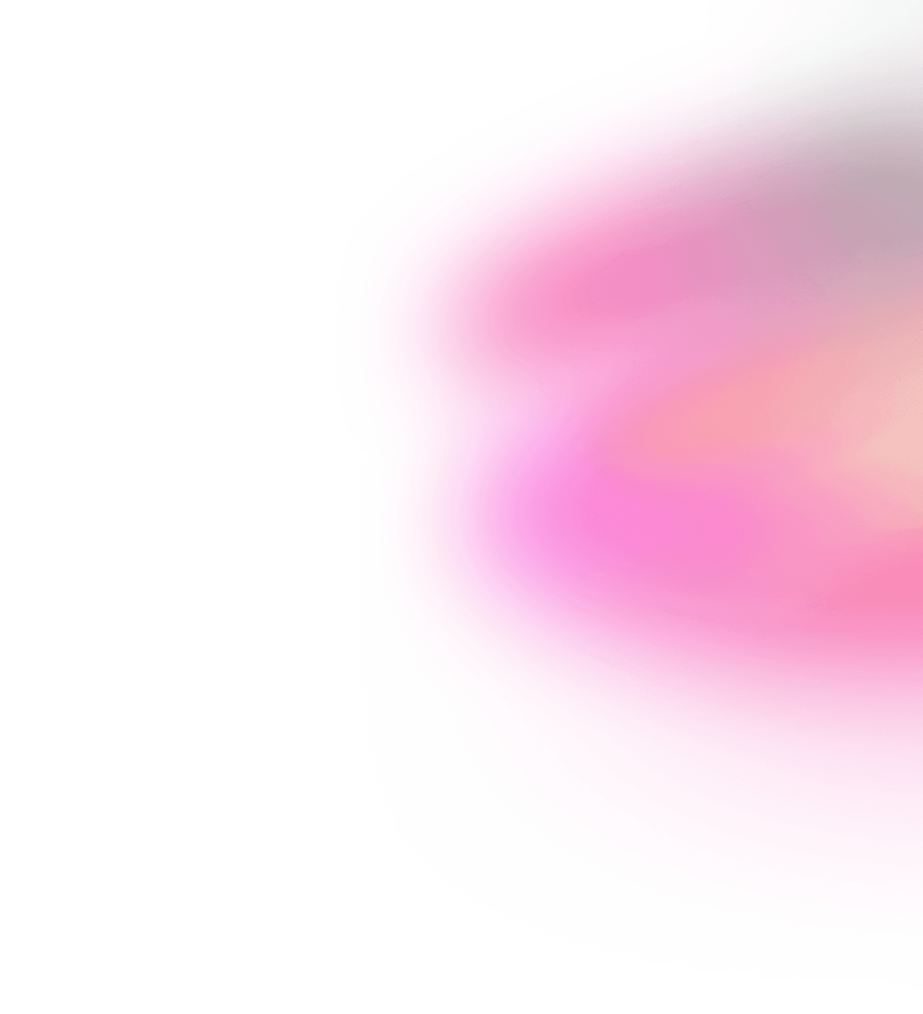
Rather than borrowing familiar rave tropes, I made the call to treat the eclipse as the core system, not a visual reference. Everything; Color, texture, motion, assets — was derived from: - The moon - The corona during an eclipse - The transition from night to dawn This prevented the brand from feeling like “EDM visuals” and gave it a distinct identity.


insights
Key Brand & Art Direction Choices
1. The Eclipse as a Reusable Motif Rather than a static logo-first approach, I designed modular brand elements inspired by: - Circular forms - Light halos - Orbital motion This gave the brand flexibility across formats while remaining instantly recognizable.


2. Night-to-Dawn as a Visual System Because the host brand is Dusk 2 Dawn, the palette and lighting direction leaned into: - Deep night tones - Gradual light emergence - High contrast moments inspired by the eclipse corona This allowed the brand to feel dynamic without relying on noise.

Why I Loved This Project
This wasn’t just visual styling. It was about: - Translating an abstract narrative into a scalable system - Using restraint to create impact - Designing an experience, not just graphics It reflects how I approach brand work at a senior level: Strong ideas, committed execution, and systems that can live beyond a single moment.